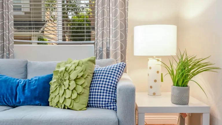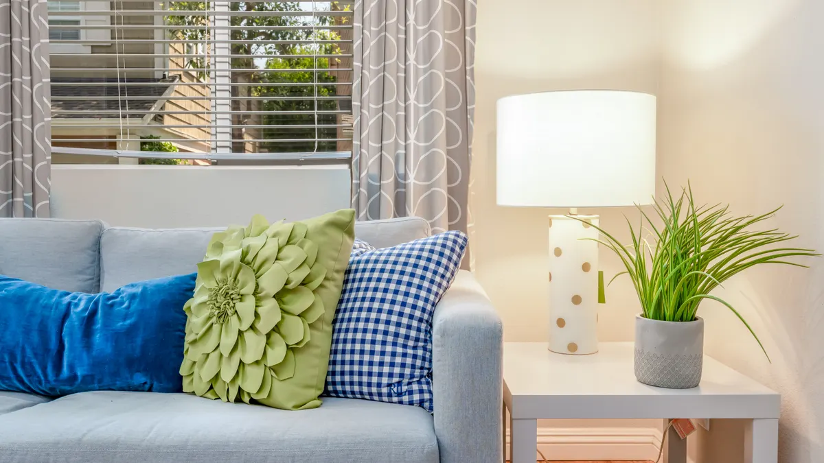
Blue sofa with colorful throw pillows and lamp
Last updated: October 27, 2026
Quick Answer: For How to Choose Pillow Cover Colors and Patterns That Match Your Room, use 3 colors and 1 to 2 patterns as a reliable starting point. Decorative pillow covers work best when they repeat the room’s strongest colors, echo one texture already in the space, and vary pattern scale so the sofa or bed looks edited, not busy. If the room already has a clear color palette, the easiest path is to pull from it instead of starting from scratch.
Key Takeaways
- Choose covers that tie the sofa, chair, bedding, rug, and walls together.
- Neutral sofas and bedding can take almost any color, but the result changes.
- Start with pattern scale, then color.
- Let the existing decor make the final call.
Start with the room you already have, not a fresh scheme
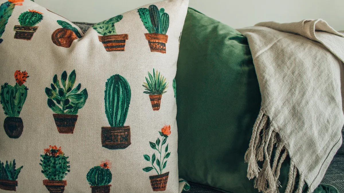
The right pillow cover colors are the ones that make the sofa, accent chair, bedding, rug, and wall color look intentional together. Start with the room’s fixed pieces: the sofa fabric, curtain color, rug, wood tone, and any art that already dominates the wall. A pillow cover does not need to match all of them; it only needs to sit comfortably among them.
A useful way to sort the room is by the 60-30-10 rule, a common interior-design ratio. The largest surfaces carry the main color, the medium surfaces carry the secondary color, and the smallest accents add contrast. If your sofa is the biggest shape in the room, it usually belongs in the 60 or 30 group. Pillow covers then live in the 10 percent role: color accents, not competition.
Use the room’s undertones before you use the obvious color. A warm gray sofa wants colors that lean warm too, such as rust, camel, olive, or cream. A cool gray sofa usually prefers slate, navy, icy green, or crisp white. The same logic works with bedding. A white duvet can carry almost anything; a cream duvet is less friendly to stark blue-white covers because the contrast looks harsher than most people expect.
If the room already feels crowded, choose one color family and stay inside it. Three shades of blue, for example, can look calmer than blue, red, green, and black all on the same sectional. That does not mean every cover must be the same tone. It means the colors should feel related: navy, denim, and pale blue can work together because they read as one family.
This is also where I would avoid the “match everything” habit. A cover that repeats the sofa exactly can disappear. A cover that repeats the curtains exactly can look like an accident if the fabric and pattern are different. Aim for connection, not duplication.
Which colors work best with neutral sofas and bedding?
Neutral sofas and bedding take almost any pillow cover color, but not every color gives the same result. Beige, gray, taupe, cream, and white are flexible because they act like a backdrop, which gives you room to decide whether the look should be calm, sharp, or lively.
For a soft room, build with muted color. Sage, clay, dusty blue, wheat, mushroom, and soft terracotta usually feel settled on a neutral base. These shades carry enough pigment to show up, yet they do not shout across the room. If the sofa is light gray and the bedding is white, a pair of sage covers and one patterned cover with cream in the background can add life without making the bed or sectional look decorated to death.
For a cleaner, more graphic room, use stronger contrast. Black-and-ivory, navy-and-white, forest green, or charcoal against cream can define the seating area fast. This works especially well when the room has simple lines and a few large shapes, such as a low sofa, one accent chair, and a plain rug. The downside is that strong contrast can look harsh if the rest of the room is already full of hard edges, shiny finishes, or busy art.
For a warmer room, think in earth tones. Terracotta, ochre, olive, tobacco, and muted coral can work with oak, walnut, brass, and woven materials. These colors are useful if the room feels flat and you want the pillows to carry some warmth without repainting the walls.
A good rule: if the room is already colorful, choose one quiet cover and one controlled accent. If the room is mostly neutral, you can go bolder with one or two covers, but keep the rest plain. Two very loud covers on a small sofa can look like a mistake, not a statement.
How do I pick pillow cover patterns without making the room busy?
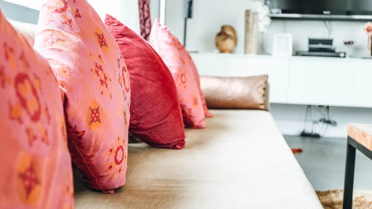
Pick patterns by scale first, then by color. Pattern scale is the size of the motif relative to the furniture around it, and it matters more than style. A 20-inch floral on a 90-inch sofa behaves very differently from a tiny stripe or a 2-inch geometric repeat.
The easiest way to avoid clutter is to mix three pattern sizes: one large, one medium, and one small. On a queen bed, that could mean a large-scale botanical print, a medium plaid, and a tiny textured stripe. On a sofa, it might be a bold abstract, a narrow ticking stripe, and a solid cover. The sizes should not all compete for attention at the same distance.
A simple pattern recipe helps:
- Choose one anchor color from the room. Pull it from the rug, art, or a chair cushion so the pattern has a reason to exist.
- Add one dominant pattern at larger scale. On a standard sofa, that usually means one cover with a motif that reads clearly from 6 to 8 feet away.
- Mix in one quieter pattern. A stripe, check, or small repeat can bridge the gap between the bold piece and the solids.
- Keep one or two covers nearly solid. Texture counts here; a woven cover in the same color family can calm the arrangement.
- Step back and check the silhouette. If every cover has the same visual weight, the grouping feels heavy. If one is clearly the star, the whole arrangement usually settles.
Patterns also need to respect the room’s architecture. A room with square windows, clean cabinetry, and a boxy sectional often looks better with stripes, grids, or simple geometrics. A room with curves, arched openings, or a rounded chair can handle softer florals or painterly prints. That is not a rule carved in stone, but it keeps the room from feeling visually confused.
The mistake I would avoid most often is matching two busy patterns with the same level of contrast. Two large, high-contrast prints on a small bed or loveseat can fight each other before the eye has a place to rest. If you want drama, keep one print large and let the others quiet down.
Use existing decor as the filter, not the afterthought
Existing decor should decide the final color choice, because the rest of the room is already doing most of the work. Look at the rug, art, lamps, throw, curtains, and the nearest accent chair before you choose a cover. If one of those pieces is visually loud, the pillow cover should usually support it rather than join the shouting.
The best shortcut is often to pull one color from somewhere unexpected. If the art over the sofa includes a muted rust line, a rust cover can make the seating area feel connected without matching the art literally. If the rug contains a small amount of green, a green cushion or cover can echo it in a way that feels designed rather than obvious. This works especially well in rooms where the main furniture is neutral and the accessories do the styling.
Pay attention to undertones, not just color names. “Beige” can look pink, yellow, green, or gray depending on the light. “Blue” can lean icy or inky. When the undertone clashes, the cover can look off even if the color sounds right on paper. This is where many generic decorating tips fail: they treat color names as if they were fixed; if you are unsure, consult a professional interior designer or color consultant, and compare samples in the room. The Old House Journal color guidance and the Color Marketing Group both note that light and context change color perception. (Source: Old House Journal, Color Marketing Group)
Lighting changes the result too. Morning light, warm lamplight, and north-facing daylight can all alter the same cover by a visible amount. If possible, compare the cover beside the sofa or bedding in the room it will actually live in, not under store lighting. That matters even more for saturated shades like navy, burgundy, emerald, and mustard, which can go muddy or too bright depending on the space.
If the room already has a strong focal point, such as a patterned rug or a large piece of art, let the cover repeat one color from that focal point and skip adding a new one. If the room is visually flat, the cover can introduce the missing color. Either way, the job is to connect surfaces, not to invent a new palette from zero.
How many colors should I use on a sofa or bed?
Three to five colors is usually enough on a sofa or bed, and fewer is often better. That count includes the main fabric already in the room, not just the covers. If the arrangement goes much past that, the eye starts reading the scene as clutter unless the room is very large and very controlled.
On a sofa, a safe formula is one solid neutral, one accent color, and one pattern that combines those colors. For example: a cream sofa, one olive cover, one cream-and-olive stripe, and one textured tan cover. That gives depth without turning the seat into a sampler. A sectional can handle one more shade because it has more surface area, but the logic stays the same.
On a bed, the safest arrangement is often quieter because bedding already occupies more visual space than a sofa. One main color, one supporting color, and one pattern are often enough. A bed can look overworked when every pillow cover tries to be special. The larger the bed, the more important it is to leave some room for plain fabric and negative space.
A plain cover is not a failure. It is often the piece that makes the other covers look deliberate. This is especially true when the room already has enough pattern from a rug, wallpaper, or curtains. A solid cover can give the eye a break and make the room feel more expensive without adding complexity.
The trade-off is obvious: fewer colors feel calmer, but they can feel flat if the textures are all identical. That is why texture matters. A matte cotton cover, a nubby weave, and a smoother printed cover can create variety even when the color range stays tight. If you want a room to feel pulled together fast, restraint is usually the better bet than variety.
Seasonal swaps: what changes and what stays the same?
Seasonal swaps work best when the base palette stays constant and only one or two cover colors change. That keeps the room from feeling re-decorated every few months. In practical terms, keep the sofa or bedding anchored with one or two perennial neutrals, then rotate the accents.
In cooler months, deeper shades usually feel appropriate: burgundy, forest green, navy, cocoa, charcoal, or dark olive. These colors pair well with heavier-looking fabrics and warmer room lighting. In warmer months, lighter or fresher tones often make more sense: soft blue, pale green, sand, cream, or washed terracotta. You do not need to replace the whole set; swapping one bold cover for a lighter one can change the mood enough.
If the room gets very little natural light, seasonal change matters less than brightness. A deep winter palette in a dark room can turn heavy quickly. In that case, keep the covers within a lighter range year-round and let the pattern change with the season instead. A small plaid in colder months and a simple stripe in warmer ones may be enough.
This is the one area where I would not chase every trend. Trend colors age fast in a room that needs to stay cohesive for 12 months or longer. If you want seasonal variety without waste, buy covers that sit close to the room’s main palette and shift only one step darker or lighter when the season changes. A beige-to-camel shift, or a slate-to-navy shift, usually feels more believable than a complete color pivot.
For a broader overview of cover types and room uses, the hub page on decorative pillow covers can fill in the product-level context that this guide leaves out. You can also compare room-scale guidance in the interior-design section on color harmony and the bedding section on decorative pillows for more examples. Decorative pillow covers, Color harmony, Decorative pillows
A simple decision order that keeps you from guessing
Choose the room’s anchor colors first, then decide whether the pillows should calm the space or sharpen it. If the room already has strong pattern, stay mostly solid. If the room is plain, use one larger pattern and one smaller one. If the sofa or bedding is neutral, you can borrow a bolder accent color; if the furniture is already colorful, the covers should usually step back.
This order keeps the decision practical:
- Identify the fixed pieces. Sofa, accent chair, bedding, rug, curtains, or wall color.
- Name the main palette. Neutral, warm earthy, cool modern, or high-contrast.
- Pick one accent color from the room. Repeat it in the cover.
- Choose pattern scale. Large, medium, or small relative to the furniture.
- Limit the total mix. Keep the arrangement to a small color family and one or two patterns.
If you are torn between two options, choose the one that repeats something already in the room. That answer is usually better than the one that simply looks pretty on its own. A good pillow cover does not need to announce itself; it needs to make the sofa, chair, or bed look like it belongs there.
How do I match pillow covers to my sofa?
Match the cover to the sofa by undertone, not just by color name. A warm beige sofa usually pairs better with rust, olive, camel, or cream than with icy blue or stark black. If the sofa is neutral, a cover can be one shade deeper or lighter than the upholstery so the difference reads clearly from across the room.
What patterns work together on pillows?
Patterns work together when they vary by scale and share at least one color. A large floral, a medium stripe, and a small geometric can sit together if they share cream, blue, or green. Two large, high-contrast prints usually fight each other unless the room is very large and the rest of the decor is quiet.
Should pillow covers match curtains or rugs?
They should echo curtains or rugs, not copy them exactly. Pull one color from the curtain or rug and repeat it in the cover, but let the pattern or texture be different. Exact matching can make the room look staged, while a close color link makes the space feel coordinated without looking forced.
Drafted with AI; not yet reviewed by a person.
About the Author