
fabric swatches laid out on a marble surface
Last updated: November 18, 2026
Quick answer: in most rooms, matching pillow covers with curtains, rugs, and bedding works best when you repeat 1 to 2 colors, echo 1 texture or pattern scale, and keep the palette in the same warm or cool family. Pillow covers look pulled together when they echo the room’s other textiles, not when they copy them exactly. Repeat one or two colors, connect one material or pattern, and keep the whole palette within the same warm or cool family. The steps below show how to make that work with curtains, rugs, bedding, a headboard, a throw blanket, and an accent chair.
Build the room palette first, then shop your covers
Pillow covers work best when you treat the room like one color story, not a pile of separate items. If your bedding, curtains, and rug already exist, the job is to find the thread that runs through all three and repeat it on the sofa or bed.
If you are unsure about undertones or a difficult mix, consult a professional interior designer or use a color-matching resource before you buy. Better Homes & Gardens offers practical room-styling guidance on repeating color and pattern across textiles, and the National Decorating Products Association explains basic color relationships in practical terms.
Here’s the catch: the match does not have to be exact. A cream cover can sit beside an ivory duvet, natural curtains, and a tan rug if the undertones all lean warm. If one item is cool gray and another is beige, the room starts arguing with itself.
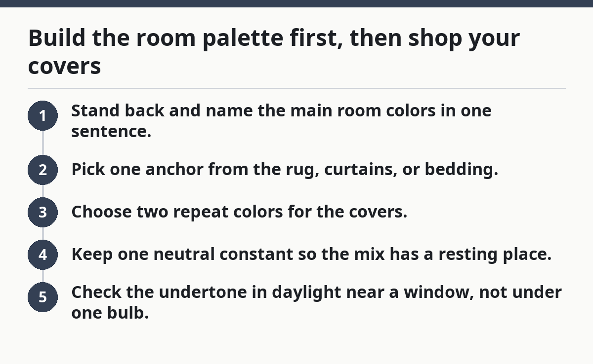
- Stand back and name the main room colors in one sentence.
- Pick one anchor from the rug, curtains, or bedding.
- Choose two repeat colors for the covers.
- Keep one neutral constant so the mix has a resting place.
- Check the undertone in daylight near a window, not under one bulb.
Use the rug as the anchor if it is the biggest visual block in the room. Use bedding if the bed is the main view. Use curtains if they hang across the widest wall and set the tone from 8 feet away.
A simple rule helps: if the room already has three strong colors, let the covers repeat only one of them and stay quieter than the rest. A busy cover in a busy room can turn the whole setup into static.
What the room should repeat
- One color from the rug border, stripe, or field
- One color from the curtains, trim, or weave
- One neutral already in the bedding, such as white, oat, or gray
- One material cue, like matte cotton beside woven drapery
If you want a quick reference, the Better Homes & Gardens color and pattern advice for room styling is useful for seeing how repetition works across textiles.
How should pillow covers match curtains?

Pillow covers should echo curtains in tone or texture, not duplicate them piece for piece. If the curtains are solid, the covers can borrow that color in a pattern or a different fabric; if the curtains are patterned, the covers should usually pull one color out of that print and simplify it.
Picture this: you have floor-length curtains, a bed or sofa under a window, and covers sitting right in the same sightline. That view is where mismatches show up first, especially with strong colors like navy, rust, or green.
The easiest route is to match one visible quality:
- Color match: Use the same blue, but not necessarily the same fabric.
- Pattern match: Repeat a stripe, small check, or floral scale.
- Texture match: Pair crisp cotton with crisp cotton, or soft weave with soft weave.
If the curtains are sheer or very light, keep the covers a step heavier in visual weight. A thick print next to gauzy panels can look off balance. On the flip side, a room with dark drapery often needs a lighter cover to stop the wall from feeling boxed in.
Avoid matching curtains and covers so closely that the room looks staged from a showroom. That usually happens with the same print in the same size and the same color on both items. It reads flat, not tailored.
Good curtain-to-cover pairings
- Solid drapes + patterned covers: best when the print includes one curtain color
- Patterned drapes + solid covers: best when the room already has busy bedding or a textured rug
- Warm drapes + warm covers: best for tan, rust, olive, and cream rooms
- Cool drapes + cool covers: best for gray, blue, black, and white schemes
If you want the room to feel calm, keep the curtain fabric and the cover fabric in the same finish family: matte with matte, sheen with sheen. That small move matters more than people think.
Match pillow covers with bedding without making the bed look flat
Pillow covers should connect to bedding through color and texture, but they need a little contrast so the bed still has shape. If the duvet, quilt, and shams are all similar, the bed can go limp fast.
Picture this: your duvet has a small print, your sheets are white, and you want the new covers to feel intentional. The answer is to repeat one color from the duvet, then choose a cover that is either smoother, chunkier, or slightly darker than the main bedding.
Use this order:
- Find the bed’s main color in the duvet or quilt.
- Choose a cover that repeats it in a softer or deeper shade.
- Add one quiet neutral already present in the bedding.
- Avoid repeating the same size pattern twice in a row.
- Step back 6 feet and check whether the bed still has depth.
A small floral quilt pairs well with a solid or pinstripe cover. A striped duvet often looks best with a cover that uses a check, a dot, or a plain weave. If the bedding already has a strong design, the cover should not compete for top billing.
This is where material matters. A crisp percale sheet set calls for covers that feel just as light and clean. A brushed or nubby cover can work with a heavier quilt, but it will look out of place beside very glossy bedding. Keep the hand feel in the same family.
Bedding combinations that usually work
- White bedding + colored covers: easy and forgiving
- Patterned duvet + solid covers: safest choice when the print is already large
- Textured quilt + simple covers: best for depth without clutter
- Matching sham + cover tone: good when the bed needs a single color story
One mistake costs more than it seems: using three different prints at once. The room stops reading as layered and starts reading as crowded. The fix is simple—let one print lead, and let the covers support it.
Use rugs to set the color base for the whole room
Pillow covers should follow the rug’s undertone and secondary colors because the rug is often the largest color block on the floor. If the rug is neutral, the covers can carry more color. If the rug is busy, the covers need to calm down.
Picture this: the rug has a beige field, charcoal lines, and a faded blue detail. That faded blue is gold for pillow covers, because it gives you a repeat color that already belongs in the room.
Start with the 60/30/10 feel, even if you never label it that way. Let the rug act like the 60, the curtains or bedding act like the 30, and the covers bring the 10-level accent. That keeps the room from feeling like every textile is shouting at once.
Use the rug to decide warmth or coolness:
- Warm rug: think cream, tan, terracotta, olive, rust
- Cool rug: think gray, slate, blue, ink, crisp white
- Mixed rug: choose the quieter color family and repeat it twice
The pile matters too. A thick rug can handle a richer cover, while a flat rug often needs more texture up top so the room does not feel one-note. A smooth cover beside a shaggy rug can be enough contrast if the color repeat is right.
If the rug is patterned, do not chase every color in it. Pick one or two and stop there. A room that repeats five rug colors across the bedding and curtains can feel busy even when each item is attractive on its own.
A quick rug-to-cover filter
- Choose the rug’s quietest accent color
- Ignore the loudest color unless it appears elsewhere
- Match undertone before exact shade
- Let the cover be cleaner than the rug
For broader room coordination, the Sherwin-Williams color tools and the Pantone Color Institute are useful references for reading undertone and color family. They are not about décor rules alone, but they help you keep warm and cool tones from colliding.
What if the accent chair or headboard changes the match?
The pillow cover should answer the strongest furniture shape in the room, especially when the headboard or accent chair brings in a new material. A wood headboard, leather chair, or upholstered frame can shift the whole palette even when the curtains and rug already seem settled.
Picture this: you have a camel chair in one corner and a dark wood headboard at the bed. Now the room needs covers that tie those pieces back to the textiles, or the soft goods and hard goods feel split in half.
Use the chair or headboard as a bridge:
- Wood headboard: repeat warm neutrals, olive, clay, or soft blue
- Leather chair: repeat tan, brown, cream, or a muted green
- Tufted fabric headboard: repeat one upholstery tone and keep the cover simpler
- Metal frame: use cooler colors or a crisp neutral to match the finish
A common mistake is choosing a cover that only matches the curtains and ignores the furniture. That can leave the chair or headboard looking like it belongs to another room. The fix is to pull a second color from the room’s hard finishes, not just the fabrics.
This also helps when the room has mixed tones. A walnut headboard can make a cool gray cover feel cold unless a warm rug or throw blanket softens the shift. A black accent chair can make pastel covers feel flimsy unless there is enough contrast somewhere else.
The fastest way to make the whole room feel coordinated
Pillow covers should repeat the room’s best color three times, then stop. That simple rule gives you a room that looks arranged without feeling overdone.
Picture this: you stand in the doorway and can see curtains, rug, bedding, a throw blanket, and the bed or chair all at once. The room feels finished when one color shows up in at least three places and no single textile fights for attention.
Use this final check:
- Pick one main color already in the room.
- Repeat it in the cover in a deeper, lighter, or quieter form.
- Echo it again in another textile, such as a blanket or rug detail.
- Balance it with one neutral so the eye can rest.
- Remove one loud item if the room still feels busy.
A good match does not make every piece identical. It makes the room look like the fabrics were chosen in the same conversation. That is the difference between a bed or sofa that feels accidental and one that feels thought through.
If you want more room-by-room examples, the hub on pillow cover design, styling, and room use sits well beside this guide and fills in the bigger styling picture.
Key Takeaways
- Repeat colors already present in the room; do not start a new palette from scratch.
- Match pillow covers to curtains, rugs, and bedding by undertone first, then shade.
- Let one textile lead and let the others support it.
- Use texture and pattern scale to keep the room from feeling flat.
- If the chair or headboard introduces a new material, use the covers to bridge it back to the rest of the room.
Should pillow covers match curtains?
They should coordinate, not clone each other. A cover can repeat the curtain color, echo its texture, or borrow one thread from its pattern. Exact matches can look stiff unless the room is very formal or very simple.
How do you coordinate pillow covers with bedding?
Pick one color from the duvet, quilt, or sham and repeat it on the cover in a different value or texture. Then add one neutral already used in the sheets or blanket so the bed stays calm and layered.
How many room colors should a pillow cover repeat?
One or two room colors is usually enough. If the cover repeats too many colors, it starts competing with the rug, curtains, or bedding instead of tying them together.
Drafted with AI; not yet reviewed by a person.
About the Author