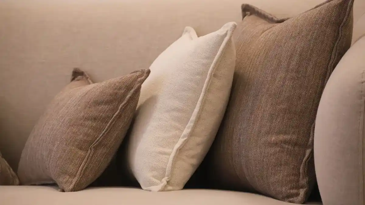
Neutral textured throw pillows on a beige sofa
Last updated: November 18, 2026
Key Takeaways
- A good pillow cover gives the room shape, not clutter, and it usually does that with one clear job: soften a hard surface, repeat a color, or add contrast.
- The right pillow cover size and shape should match the furniture first, then the look you want.
- Fabric choice depends on touch, wear, and light, and each room asks for its own balance.
- Styling works best with layers, contrast, and restraint, usually starting with the biggest pillow at the back.
Pillow covers can fix a room faster than paint, and the right cover usually makes a sofa, bed, or chair look finished instead of random. Quick answer: choose the cover size, fabric, color, and pattern for the room’s use first, then style the fill and placement second. Pillow cover design, styling, and room use — The Complete Guide starts with fit, because a 20 x 20 inch square or a 12 x 20 inch lumbar changes the room differently. The sections below settle what works on a bed, couch, accent chair, and floor cushion.
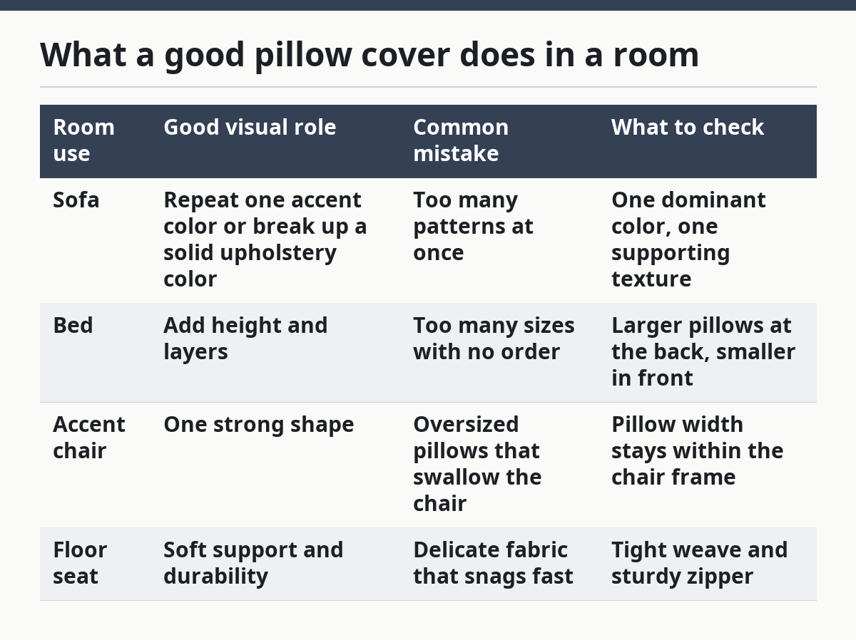
What a good pillow cover does in a room

A good pillow cover gives the room shape, not clutter, and it usually does that with one clear job: soften a hard surface, repeat a color, or add contrast. If the cover fights the furniture, the room starts to look busy within about 2 seconds of walking in.
Picture this: you’re standing in front of a sofa that already has a throw, a lamp, and a rug with a pattern. The right cover should let your eye land, not bounce around. The key is the scale of the cover—notice how a 20 x 20 inch square reads calm on a wide couch, while a tiny 12 x 20 inch lumbar can look lost. This is what separates a finished room from a random pile.
| Room use | Good visual role | Common mistake | What to check |
|---|---|---|---|
| Sofa | Repeat one accent color or break up a solid upholstery color | Too many patterns at once | One dominant color, one supporting texture |
| Bed | Add height and layers | Too many sizes with no order | Larger pillows at the back, smaller in front |
| Accent chair | One strong shape | Oversized pillows that swallow the chair | Pillow width stays within the chair frame |
| Floor seat | Soft support and durability | Delicate fabric that snags fast | Tight weave and sturdy zipper |
The smartest rule is simple: use the cover to support the room’s main line, not invent a new one. If your room is calm, keep the cover quiet. If the room is plain, let the cover carry the pattern.
How do you choose the right pillow cover size and shape?
The right pillow cover size and shape should match the furniture first, then the look you want. A 18 x 18 inch square does a different job than a 12 x 20 inch lumbar, and forcing the wrong shape onto the wrong seat is the fastest way to make a room feel off.
Picture this: you have a deep sofa, a narrow bench, and a queen bed. Each surface wants a different outline. The shape is not decoration here—it’s the silhouette that decides whether the room feels tidy or lopsided. A square cover can look full and stable; a lumbar can guide the eye horizontally; a round or bolster shape can soften hard corners. That’s the actual design work.
- Measure the furniture first. Check the seat width, back height, and available depth. A 24-inch-wide chair rarely needs a 24-inch pillow.
- Pick the job. Decide if the cover is for comfort, support, or style only. Don’t choose a large fill if the seat is already deep.
- Match shape to surface. Use square covers for couches and beds, lumbar shapes for chairs and benches, and round shapes for softer accents.
- Check the fill size. A cover usually looks better with a slightly larger insert, but too much fill strains seams and makes corners point out awkwardly.
- Look at edge treatment. If a cover will be used frequently or if seams look uneven, check with a professional upholsterer or textile expert, and compare the finish against a care label or product guidance from the maker. Edge treatment can change the visual weight, so avoid heavy trim on a small frame.
- Test the spacing. Leave breathing room between pillows and armrests. Crowding the edges makes the seat look smaller.
- Use odd numbers for groups. Three pillows on a sofa usually reads cleaner than four identical ones.
| Common cover size | Best use | Visual effect | Watch out for |
|---|---|---|---|
| 16 x 16 in | Small chairs, reading nooks | Light and tidy | Can look tiny on a large sofa |
| 18 x 18 in | Most sofas and beds | Balanced, flexible | Too many same-size squares feel flat |
| 20 x 20 in | Large sofas, king beds | Fuller, more anchored | Can overwhelm small furniture |
| 12 x 20 in | Benches, armchairs, layered beds | Long, directional line | Looks thin if used alone on a deep couch |
Here’s the catch: the cover size should solve the furniture, not just match your shopping habit. A room with a low-profile sofa and a narrow lumbar often looks more intentional than one packed with six oversized squares.
What fabrics work best for different rooms?
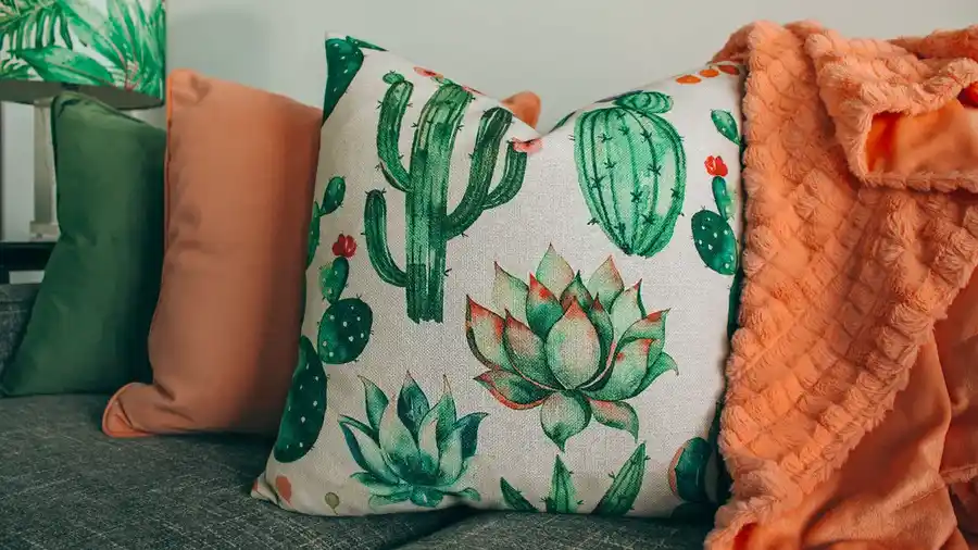
The best fabric depends on touch, wear, and light, and each room asks for a different balance. Cotton and linen read relaxed; velvet reads rich; wool feels heavy and seasonal; woven synthetics often handle traffic better. The fabric changes how the same color looks in daylight, evening light, and under lamps.
Picture this: you’re choosing between a smooth weave and a plush pile for the same beige cover. On a sunny room, the smooth version looks crisp and airy; the plush one catches shadow and looks deeper. That’s why fabric choice matters even when the color name is identical. The surface finish changes the room’s mood.
| Fabric type | Best room use | Strength | Drawback |
|---|---|---|---|
| Cotton | Family rooms, casual beds | Easy to live with, often washable | Can wrinkle and look soft-edged fast |
| Linen | Summer rooms, relaxed bedrooms | Airy, textured, natural look | Creases easily and can read too casual in formal rooms |
| Velvet | Formal living rooms, bedrooms | Strong color depth, rich hand | Shows pressure marks and can feel warm in hot rooms |
| Wool blend | Winter rooms, reading corners | Cozy and substantial | Can feel scratchy and heavy |
| Performance weave | Busy sofas, kids’ rooms, rentals | Better for frequent use | Sometimes looks less natural up close |
The right choice is about how the room is used for 8 hours a day, not how it looks in a product photo. If a sofa gets movie-night use, a tougher weave beats a delicate surface that needs careful handling.
A quick fabric guide:
- Choose cotton or linen for relaxed rooms that need easy styling.
- Choose velvet when you want depth and stronger color.
- Choose performance fabric when hands, pets, or snacks are part of the scene.
- Skip highly fragile trims on seats that get daily use.
On the flip side, a delicate fabric can still work if the pillow is mostly decorative and stays on a guest bed or a low-use chair. That’s a styling choice, not a mistake.
How should you style pillow covers on a sofa or bed?
The best styling uses layers, contrast, and restraint, and it usually starts with the biggest pillow at the back. If every pillow fights for attention, the group looks messy in under a meter of viewing distance.
Picture this: you’re standing at the foot of a bed or facing a three-seat sofa. The first thing to settle is the order. Large pillows go back, medium ones sit in front, and smaller accents should finish the line—not compete with it. The key here is visual weight—notice how a dark, textured cover can anchor a light sofa even when the shape is simple.
- Place the largest pillows first. Set the biggest squares or shams at the back.
- Add one contrast shape. Use a lumbar or a smaller square to break the repeated outline.
- Repeat one color. Pull one color from the rug, art, or curtain and echo it in at least one cover.
- Mix texture, not chaos. Pair smooth fabric with a woven or plush surface instead of mixing every finish available.
- Check the edge line. Make sure the pillows meet neatly without sagging.
- Limit the pattern count. Two patterns can work; three is already tricky in a small room.
- Step back 6 feet. If the group reads as one clear composition from that distance, it’s working.
| Setup | Best for | Visual result | Common error |
|---|---|---|---|
| Two squares + one lumbar | Standard sofa | Clean, classic balance | All three fabrics look identical |
| Three squares | Large sofa or bed | Full and symmetrical | Too much repetition with no break |
| One lumbar + two small squares | Narrow bench or small couch | Light and tailored | Lumbar is too small to hold the center |
| Layered bed set | Primary bedroom | Hotel-like order | Too many sizes with no hierarchy |
The truth is, styling works best when one cover is the star and the others back it up. A room with six strong voices has no voice at all.
What patterns, colors, and trims actually look good together?
The best pattern and color mix uses one dominant tone, one support tone, and one accent, and that’s usually enough. A room with a safe neutral sofa can handle bolder covers; a room with patterned curtains or rug usually needs quieter ones.
Picture this: you have a gray couch, a striped rug, and framed art with blue and rust. The cover choice should echo one of those colors, not invent a fourth or fifth theme. The pattern should be readable from across the room. If it looks like static from 10 feet away, it’s too busy.
Good combinations tend to follow a simple ladder:
- Solid + texture for calm rooms.
- Solid + small pattern for balance.
- Large pattern + solid for one clear focal point.
- Two related patterns only when their scale differs a lot.
Bad combinations usually fail for one of these reasons:
- The prints are the same size, so they compete.
- The colors are close but not close enough, so they look accidental.
- The trim is loud, and the fabric is already loud.
- The room has too many surfaces trying to speak at once.
The trim matters more than most people think. A narrow piping line makes a cover look tailored. Fringe adds movement. Tassels and ruffles push the look toward casual or decorative. If the furniture already has strong lines, keep the trim quiet. If the room feels flat, a small edge detail can help.
A practical color rule:
- Use 60/30/10 as a loose guide for dominant, secondary, and accent colors.
- Keep the cover in the 10 or 30 group, not all three.
- If the room is already colorful, choose a textured solid instead of a loud print.
What room use should decide your pillow cover choice?
Room use should decide the cover before style does, because a cover that looks perfect but wears out fast is the wrong cover. A guest room can tolerate more delicate fabric than a family sofa, and a floor cushion needs a sturdier finish than a bed sham.
Picture this: you’re choosing covers for four rooms in the same house. The living room needs durability, the bedroom wants softness, the entry bench needs a clean shape, and the sunroom needs something that handles glare and wear. Same house, four different jobs. The fabric, closure, and fill need to match each one.
| Room use | Best cover traits | Good design move | Avoid this |
|---|---|---|---|
| Living room | Durable weave, hidden zipper, easy care | Mix one pattern and one solid | Delicate trim on daily-use seating |
| Bedroom | Soft hand, layered texture | Use larger pillows and relaxed tones | Overloading the bed with too many styles |
| Home office | Smaller scale, structured shape | One lumbar for support and a second for color | Overstuffed pillows that crowd the chair |
| Entry bench | Firm outline, wipeable fabric if possible | One or two narrow shapes | Bulky pillows that eat the seat space |
| Floor seating | Strong seams and tough fabric | Low, square forms | Thin covers that slip out of shape |
A second useful rule is timing. If a room changes seasonally, keep a base set in neutral tones and rotate one or two covers by season. That gives the room a new note without replacing everything.
For care, follow the care label rather than guessing. Many covers close with zippers and may be removable, but the exact cleaning method varies by fabric and construction. A hidden zipper is cleaner visually, while an exposed zipper can read more casual and be easier to use. If a cover will be opened often, check the zipper pull and seam finish before buying.
What details make a pillow cover look expensive instead of sloppy?
A cover looks expensive when the seams, corners, closure, and insert shape all work together, and it looks sloppy when one of those parts fails. The smallest flaws show up fast on a flat surface, so this is where careful design pays off.
Picture this: you pick a beautiful fabric, but the corners collapse, the zipper ripples, and the insert is too small. The cover still has the right color, but the room reads unfinished. The key is the corners—notice how a well-filled corner holds a sharp edge without stretching the seam. That is the difference between crisp and cheap-looking.
- Check seam straightness. The stitching should run even from end to end. Loose lines make the cover sag.
- Inspect the corners. Corners should form a clear point or a clean curve, not a baggy fold.
- Look at the closure. Hidden zippers should sit flat; visible ones should not buckle the fabric.
- Match the fill to the shape. A too-small insert leaves empty corners, and a too-large one strains the edges.
- Confirm the back and front finish. Reversible covers need both sides to look intentional.
- Touch the surface in strong light. The Textile Exchange and similar textile testing guidance both note that surface issues can show differently under light, so check for thin spots, shine, or uneven weave near a window.
- Check the edge after stuffing. If the sides twist or roll inward, ask a professional upholsterer or textile specialist to assess the construction.
Two standards are worth knowing here. OEKO-TEX Standard 100 is a textile certification related to harmful substance limits, and it matters if you care about fabric safety claims. Care labels also matter because they tell you how the cover should be cleaned, pressed, or dried. If the label is vague, that’s a warning.
A polished cover is not loud. It just sits right.
How do you use pillow covers in different rooms without overdoing it?
You use pillow covers by giving each room one clear role, one main color story, and one restraint rule. That keeps the house connected without making every room look identical.
Picture this: the living room has a bold accent cover, the bedroom has soft neutrals, and the reading chair gets one textured lumbar. The rooms still feel related because the palette repeats, but each space behaves differently. The goal is not matching—it’s continuity.
A simple room-by-room map:
- Living room: Use durable covers and vary one texture or pattern across the set.
- Bedroom: Keep the base calm, then add one richer fabric for depth.
- Dining bench or banquette: Choose slim shapes that don’t block movement.
- Nursery or guest room: Go for easy cleaning and soft color shifts rather than high contrast.
- Outdoor-adjacent rooms: Pick fabrics that can handle more light and more frequent care.
The strongest mistake is treating every room as if it needs the same trio of pillows. It doesn’t. A bench needs fewer, tighter shapes than a bed. A large sectional can take more layers than a small apartment sofa. A narrow chair usually looks best with one pillow, not three.
If the room already has a strong rug, curtains, or art, let those pieces lead. The pillow cover should echo them, not yell over them. That’s the simplest way to keep the room readable.
Pillow cover decisions that save you from common mistakes
The best decision is to choose the cover for the furniture and the wear pattern before you fall for a print. That order saves money and fixes most styling problems before they start.
Picture this: you’re about to buy a cover because the color is perfect. Stop there and check the size, fabric, closure, and room use first. A gorgeous cover in the wrong shape or a fragile fabric on a family sofa becomes a problem in a week.
Use this checklist:
- Does the size match the seat or bed?
- Does the shape support the furniture?
- Does the fabric fit the room’s traffic?
- Does the color repeat something already in the room?
- Does the pattern scale match nearby textiles?
- Does the closure sit flat and feel durable?
- Does the care label fit the way the room gets used?
One last trade-off matters. A minimalist room can use plain covers, but plain does not mean blank. Texture, edge finish, and insert shape still need attention. If those three parts are right, even a simple cover can carry a room.
FAQ
What size pillow cover looks best on a sofa?
A 18 x 18 inch or 20 x 20 inch cover usually works best on a standard sofa because it fills the seat without swallowing it. Smaller sofas often need 16 x 16 inch covers, while a deeper sectional can handle larger squares or a lumbar shape.
Should pillow covers match the couch exactly?
No, exact matching usually makes the room look flat. A better choice is to repeat one color from the couch, rug, art, or curtains and use texture or pattern to separate the cover from the upholstery.
Is linen or velvet better for pillow covers?
Linen is better for a relaxed, airy look, while velvet is better when you want depth and a richer finish. Linen wrinkles easily and reads casual; velvet shows color strongly but can mark more easily in daily use.
How many pillow covers should I use on one sofa?
Most sofas look best with 2 to 4 covers, depending on size. Too many pillows crowd the seat and hide the furniture, while too few can leave the sofa looking bare.
What makes a pillow cover look cheap?
Loose seams, sagging corners, a weak closure, and an insert that’s too small are the biggest problems. A cover looks finished when the corners stay sharp, the fabric lies flat, and the scale fits the furniture.
Drafted with AI; not yet reviewed by a person.
About the Author