
Minimal living room with sofa and pale pillows
Last updated: November 18, 2026
Quick answer: for How to Choose Pillow Covers for a Minimal, Modern, or Cozy Interior, start with one cover style per room mood, then narrow by texture, color temperature, pattern scale, and finish. Decorative pillow covers can make a room read minimal, modern, or cozy without changing the sofa, bed, or chair. The right cover depends on texture, color temperature, pattern scale, and finish—not just the fabric name. The guide below settles which covers suit each style and which ones to skip.
Our Top 3 Picks at a Glance
-
1 Best Overall: a matte, low-contrast decorative pillow cover in a solid or nearly solid color
-
2 Best Budget Pick: a plain cotton cover with a simple zip closure and no fussy trim
-
3 Best Heavy-Duty / Upgrade Pick: a heavier weave or plush cover with enough body to hold shape on its own
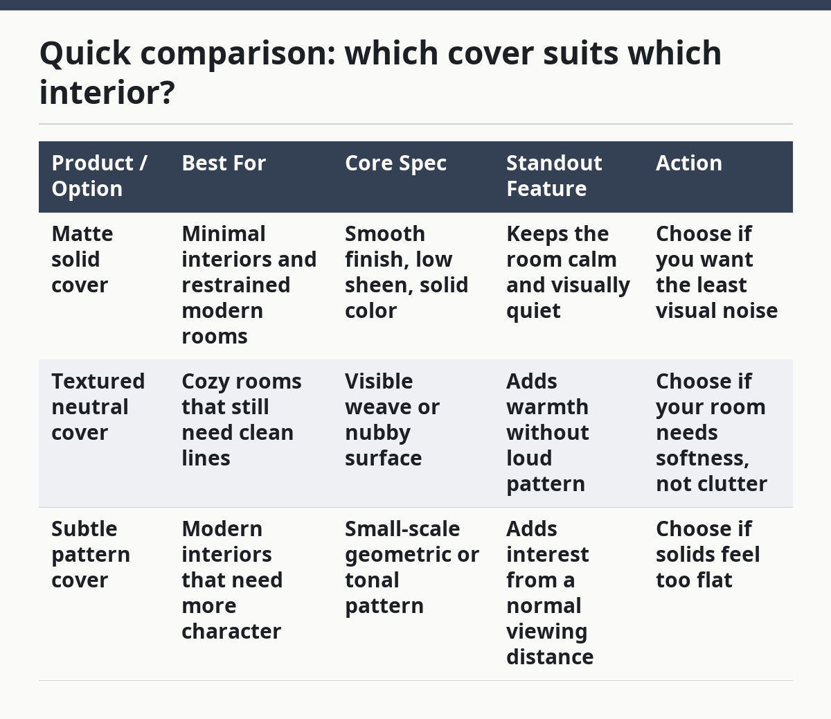
Quick comparison: which cover suits which interior?

| Product / Option | Best For | Core Spec | Standout Feature | Action |
|---|---|---|---|---|
| Matte solid cover | Minimal interiors and restrained modern rooms | Smooth finish, low sheen, solid color | Keeps the room calm and visually quiet | Choose if you want the least visual noise |
| Textured neutral cover | Cozy rooms that still need clean lines | Visible weave or nubby surface | Adds warmth without loud pattern | Choose if your room needs softness, not clutter |
| Subtle pattern cover | Modern interiors that need more character | Small-scale geometric or tonal pattern | Adds interest from a normal viewing distance | Choose if solids feel too flat |
What should pillow covers look like in a minimal interior?
Minimal interiors need the quietest cover you can find, usually in a solid color, low sheen finish, and restrained texture. The goal is to let the sofa or bed frame stay in charge while the cover supports the room instead of announcing itself.
Picture this: you’re standing in front of a plain linen sofa, a pale rug, and one black floor lamp. A pillow cover with a loud print or shiny surface will break that calm in seconds. A matte cover in ivory, stone, clay, or charcoal keeps the room feeling disciplined.
That’s the point.
Use this checklist for minimal rooms:
- Choose a solid or near-solid cover first.
- Keep pattern size tiny or skip pattern entirely.
- Look for a matte finish rather than shine.
- Match the color temperature to the room: warm neutrals for warm wood, cool neutrals for metal and pale gray.
- Use one texture change at a time, not three.
An easy mistake is picking a cover that is “simple” but still too busy. A bold zipper, thick piping, or shiny fabric can make a plain room look fussy. The fix is plain: choose a cleaner edge and a flatter surface.
If you want a room that reads edited rather than empty, this is a reliable lane. If you want a strong decorative moment, it’s the wrong lane.
How do you choose pillow covers for a modern interior?
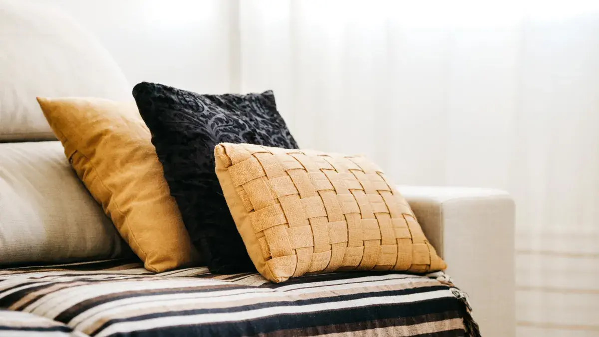
A modern interior usually looks best with clean lines, medium contrast, and controlled texture. The cover should feel intentional, not decorative for its own sake, which means the shape, finish, and pattern scale matter as much as the color.
Picture this: you have a structured sofa, a metal coffee table, and a few straight-edged frames on the wall. A cover with a big floral print or heavy ruffle will fight the room. A cover in charcoal, deep olive, rust, or off-white with a tight grid, thin stripe, or tonal weave will fit the architecture better.
Here’s a simple decision order:
- Start with the room’s strongest line. If the furniture is angular, pick a cover with crisp edges and little trim.
- Choose one pattern scale only. Small geometric marks or broad color blocks work better than mixed-size prints.
- Balance hard surfaces with some softness. A woven cover can warm up stone, glass, or metal without turning the room cozy-heavy.
- Keep sheen under control. A little luster can work, but high shine can make a modern room look more formal than current.
- Repeat one color from the room in a quieter way. That might be the wall tone, a chair, or a rug stripe.
The common mistake here is chasing “modern” with the wrong cues. Oversized prints, glossy fabric, and too many contrast colors can make the space feel staged instead of clean. A better choice is often less dramatic, not more.
Modern rooms can take a little edge, but not chaos. The cover should look deliberate from across the room and still calm up close.
How do you make a room feel cozy without making it messy?
A cozy interior needs soft texture, warmer color temperature, and a cover that looks touchable from across the room. Cozy does not mean random. It means the room feels layered, lived in, and comfortable without turning into visual clutter.
Picture this: you’ve got a sofa that feels a bit flat, a lamp with a warm bulb, and a throw blanket folded nearby. A flat, stark cover will make the space feel colder than it is. A cover with a visible weave, brushed surface, or plush feel gives the room more comfort right away.
Choose cozy covers like this:
- Pick warmer neutrals, muted earth tones, or softened jewel tones.
- Look for texture that reads from 3 to 6 feet away.
- Mix one smooth cover with one textured cover rather than covering every surface in the same fabric.
- Use pattern sparingly and keep it softer, smaller, or more tonal.
- Let the cover feel slightly fuller if the room already has a lot of hard edges.
Here’s the catch: cozy rooms can tip into clutter fast. Too many nubby surfaces, too many prints, and too many colors can make the room feel busy instead of inviting. The fix is contrast control. If the sofa is already plush, pick a cleaner cover. If the sofa is plain, add the texture there.
A cozy room works best when the cover looks like a comfort piece, not a craft project.
Which fabric feel fits each style: linen, velvet, cotton, or silk?
The right fabric feel depends on the mood you want, and the finish matters as much as the fiber name. Linen, velvet, cotton, and silk each push a room in a different direction, even when the color is the same.
Picture this: you hold four covers in the same neutral shade. One has a dry, relaxed weave. One looks plush and dense. One feels crisp and flat. One catches the light with a smoother face. Each one changes the room in a different way.
A quick style map:
- Linen works well for minimal and cozy rooms because it reads relaxed and natural.
- Velvet fits cozy and some modern rooms because it adds depth and a soft glow.
- Cotton is the easiest all-around choice when you want a clean look with less fuss.
- Silk leans dressier and more formal, so it fits a polished modern space better than a casual one.
The trade-off is simple. Linen can wrinkle and look lived in, which is great for some rooms and wrong for others. Velvet can feel rich but may look too heavy in a very bare minimal room. Cotton can look plain if the weave is too basic. Silk can look elegant, but it often feels too refined for a soft, everyday interior.
If the room already has enough texture, choose a flatter fabric feel. If the room feels sharp or cold, choose a richer surface. That’s usually the better call than trying to match fabric names to style labels alone.
How do I mix solid and patterned pillow covers without getting busy?
Mixing solids and patterns works best when one cover leads and the others support. The ratio is usually one patterned cover paired with solids, or two quiet textures with one subtle print, so the eye has a place to rest.
Picture this: you have a sofa, a throw, and a rug already doing a lot. If every cover has its own loud voice, the whole setup starts to feel crowded. If one cover gives the room a point of interest and the others stay quiet, the arrangement looks finished instead of loud.
Use this simple method:
- Pick the most dominant textile in the room first, often the rug or curtain.
- Choose a pattern that echoes that room mood, not one that competes with it.
- Keep the pattern scale consistent with the room size. Small rooms usually want smaller, calmer marks.
- Add one or two solids in the same color family to hold the arrangement together.
- Stop before every cover becomes a statement piece.
A common mistake is mixing three different pattern scales at once: tiny dots, medium stripes, and a large motif. That usually costs the room its calm. Another mistake is treating every patterned cover as equally bold; a home stylist or interior designer can help gauge scale, and Better Homes & Gardens notes that mixing patterns works best when one print stays dominant and the others stay quieter. One patterned piece is a focal point; three can become noise.
The mix often feels almost plain until you notice the texture and shape. That is usually a good sign.
What finish, trim, and closure details should you check before buying?
Finish, trim, and closure details decide whether the cover feels polished or awkward, especially in a minimal, modern, or cozy interior. The front may look right online, but the edge work and closure can still throw the whole thing off.
Picture this: you’ve picked a color you like, but the cover arrives with shiny piping, bulky tassels, or a zipper that shows from every angle. That detail can overpower the room faster than the color itself. Small parts matter here.
Check these details before you buy:
- Finish: matte for minimal rooms, mild sheen for modern rooms, softer texture for cozy rooms.
- Trim: clean edges are safest; piping, fringe, and tassels work only if the room already has room for them.
- Closure: hidden zippers usually look cleaner than exposed ones.
- Edge shape: crisp seams suit modern spaces; softer edges can suit cozy spaces.
- Insert fit: a too-loose cover looks slouched; an overstuffed one can look stiff.
Here’s the truth: finish changes mood faster than most people expect. A simple neutral in a glossy finish can look dressy. The same color in a matte weave can look relaxed and current. That’s why “neutral” is not a style by itself.
If you want a room that feels calm and intentional, the cover should disappear a little. If it shouts from across the room, it’s probably doing too much.
A simple buying order that keeps the room from drifting off style
The easiest way to choose is to work from the room outward, not from the shopping page inward. Start with the room’s style, then match texture, then pattern, then finish, then closure details. That order keeps the cover from becoming the wrong kind of accent.
Use this order every time:
- Name the room mood: minimal, modern, or cozy.
- Pick the surface feel: matte, lightly textured, plush, or softly lustrous.
- Decide on pattern size: none, tiny, or restrained.
- Check the edge details: piping, fringe, plain seam, or hidden zip.
- Hold the choice against the other textiles in the room.
- Buy only when the cover supports the room from 6 feet away and at arm’s length.
The core buying step is simple: start with the room mood, then test the cover at 6 feet and at arm’s length. You do not need a dramatic cover to make a room feel finished. In many rooms, the right choice is the one that feels obvious after it is in place.
For broader shopping decisions on decorative pillow covers, the main hub on pillow cover shopping and buying decisions can help you compare style-led choices with the rest of the buying process.
Key Takeaways
- Minimal rooms usually need plain covers, low shine, and very little pattern.
- Modern rooms do best with clean edges, controlled contrast, and one clear design idea.
- Cozy rooms need touchable texture, warmer color, and softer visual weight.
- Linen, velvet, cotton, and silk each change the room mood even in the same color.
- One patterned cover is often enough; the rest should support it.
- Trim, sheen, and closure style can make or break the final look.
Drafted with AI; not yet reviewed by a person.
About the Author