
woman holding a stack of pillows
Last updated: November 18, 2026
A pillow insert controls how a cover looks far more than most people expect, and this article on Pillow Inserts vs Pillow Covers: Fit, Loft, and Shape explains why. A 20-inch cover can look flat, taut, or plush depending on fill, loft, and shape, and that is why pillow insert fit is the real issue—not just cover size. Quick answer: the right insert is usually the one that matches the cover’s silhouette and gives enough loft to shape it without overstretching the seams.
Key takeaways
- A firmer insert creates a fuller front, tighter corners, and less wrinkling at the seams.
- Softer fills drape more, but they can leave a cover looking baggy unless the cover is very structured.
- Loft matters because thickness changes the way the face of the cover sits, even when the width and length match.
- Shape matters because square, lumbar, and round inserts push fabric in different directions.
- The best insert is not always the biggest one; the wrong amount of fill can make a cover look sloppy or overstuffed.
What pillow insert fit actually changes
Pillow insert fit changes the whole surface of the cover, not just how full it feels. A 20 x 20 cover with a low-loft insert can look like a loose envelope, while the same cover with a denser insert can stand up with crisp edges and a more tailored front. That difference shows up even before anyone touches it.
Fill type is the first variable. A down insert compresses easily and usually gives a softer, more relaxed silhouette. A polyfill insert tends to hold more body for the same nominal size, though quality varies a lot by construction. A memory foam insert behaves differently again: it resists collapse and keeps a firm profile, which can help a cover look sculpted but can also make the cover feel stiff if the shape is a bad match.
The second variable is loft. Loft is the height or thickness of the insert when it is fully fluffed. Two inserts labeled the same size can produce very different looks if one has more internal spring than the other. In simple terms, loft is what turns fabric from flat to dimensional.
Shape is the third variable. Square inserts fill square covers cleanly. Lumbar inserts are built to stretch the fabric horizontally and leave a longer, lower profile. Round inserts create a puffed center and soft edges, which is useful for some decorative looks but awkward in a cover that expects corners.
The main mistake is treating the cover label as the whole answer; consult a professional or the manufacturer’s sizing guidance when the fit is unclear. The cover sets the outer dimensions; the insert sets the visual effect. That is why the same cover can look minimal on one sofa and plush on another. The National Sleep Foundation notes that pillow support and loft affect comfort and alignment, which is another reason fit matters beyond the label.
Which fill changes the look the most?
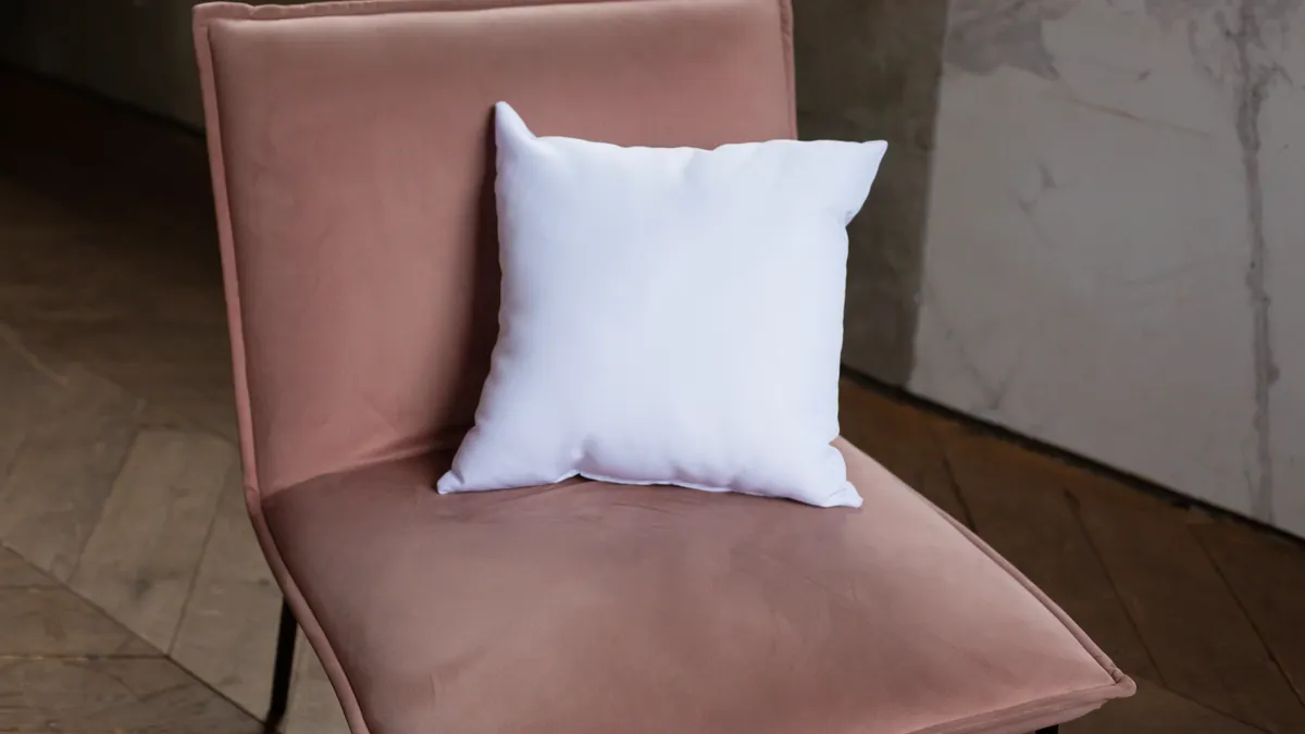
Down inserts usually give the softest, most forgiving look, while firmer polyfill and memory foam inserts create sharper shape and more visible edge control. That difference matters because the fill determines how much the cover can collapse, billow, or stay defined.
Down insert filling compresses into corners easily and then fluffs back with shaking. That makes it useful for a relaxed, slightly luxurious look. It is also the least rigid option, so if the goal is a very crisp square face, down can leave the center a little too soft unless the insert is generously sized. It is a poor choice for someone who wants a perfectly architectural look.
Polyfill insert designs vary more than people expect. Some are airy and soft; some are packed tighter and springier. A denser polyfill insert can produce a fuller appearance without the weight of down, but low-grade fill can clump or collapse over time, which means the cover starts looking uneven. For a budget-sensitive setup, polyfill is often the middle road. It is not always the best choice when absolute shape retention is the priority.
Memory foam insert styles hold their form best, and that is both the appeal and the drawback. They are useful when the cover needs a clean outline, but they can create pressure points that show through thin fabric. If the cover is very lightweight or loosely woven, the insert can read as lumpy or too structured. This is the wrong fill for a soft, sink-in look.
A simple rule helps: softer fill gives a more casual silhouette; firmer fill gives a more tailored one. If the cover has a delicate weave or a relaxed drape, down often looks better. If the cover is meant to sit upright on a bench or bed, a firmer polyfill or memory foam insert usually keeps the shape cleaner. Pottery Barn’s insert and cover guidance also reflects this fill-to-look tradeoff.
How loft changes the fit of a cover
Loft changes whether a cover looks underfilled, balanced, or overstuffed. A low-loft insert leaves extra air space in the corners and along the edges, while a higher-loft insert pushes the seams outward and reduces visible slack.
Think of loft as the insert’s height under compression. A flatter insert may technically match the cover’s dimensions, but it can still look wrong because the front panel does not have enough push behind it. That is why two inserts with the same nominal width and length can produce very different results.
This is where the overstuffed look becomes a design choice, not a mistake. An overstuffed insert makes the cover front feel full and polished, especially on square inserts that need their corners to look square instead of drooping. It can also hide minor wrinkles in the fabric. The trade-off is tension: too much loft can strain seams, make zippers harder to close, and exaggerate any puckering in the cover fabric.
A lower-loft insert has the opposite trade-off. It is easier to fit and kinder to fragile seams, but it can leave the cover looking tired. The front may wrinkle, corners may collapse, and the whole piece can lose visual weight.
If the cover fabric is structured, like a heavier weave, more loft usually looks intentional. If the cover fabric is soft or thin, a very lofty insert can make every edge look stretched. The best fit is the one where the cover sits smoothly but still looks full enough that the edges have shape.
A practical check: if the cover forms a flat square before fluffing and then springs into a defined shape after 10 to 15 seconds of arranging, the loft is probably working with the cover instead of against it.
What shape should the insert be?
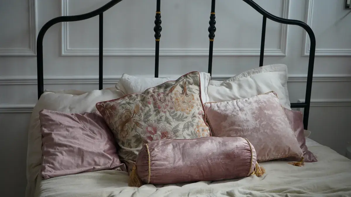
The insert shape should match the cover shape unless the goal is a specific styled look. Square inserts belong in square covers, lumbar inserts belong in lumbar covers, and round inserts are best reserved for covers made to show a circular profile.
Square inserts are the most forgiving because they distribute fill into all four corners. They are the standard choice for throw-style covers and the easiest way to get a balanced front. A square insert that is too soft tends to slump diagonally, which can make the cover look like it needs refilling even when the size is correct. This is why square inserts often work better with enough loft to hold the corners open.
Lumbar inserts behave differently. Because they are rectangular, they place tension along the longer axis and leave the cover with a lower, more elongated presence. That makes them useful on beds, benches, and narrow chairs, where a square shape can look bulky. They are the wrong choice if the cover opening is built for a square insert and the goal is a compact, centered look.
Round inserts create a domed face and soft perimeter. They can look polished in the right cover, but they also reveal every mismatch quickly. If the cover is too large for the insert, the roundness disappears and the fabric sags in the middle. If the insert is too firm, the circle can look forced and unfinished.
This is where shape retention matters. A shape-retaining insert keeps the silhouette visible longer between fluffs. A softer insert will settle faster, which is fine for a casual room but not for a styled shelf, bench, or bed setup where the insert needs to look composed for hours. In IKEA-style practical terms, the shape you choose has to survive daily use, not just a styled photo.
For a reader trying to decide fast: square for most covers, lumbar for long narrow covers, round only when the cover is made to show a circular form.
How to get the right look from pillow inserts
The right look comes from matching fill, loft, and shape to the visual job the cover has to do. Start with the room, not the label on the insert. The same Pillow Inserts vs Pillow Covers: Fit, Loft, and Shape principles apply whether the goal is a sofa, bed, or bench.
- Name the look first. Decide whether the cover should look soft, crisp, or stuffed. A relaxed sofa usually benefits from a softer down insert, while a formal bed arrangement often wants a fuller polyfill or memory foam insert.
- Check the cover fabric. A thin, pliable cover shows every seam line, so a very firm insert can telegraph through the face. A heavier fabric tolerates a higher-loft insert and usually looks more finished.
- Match the shape before the fill. A 22-inch square cover needs a square insert; a 14 x 20 lumbar cover needs a lumbar insert. Shape mismatch creates the wrong silhouette even when the fill is excellent.
- Decide how full you want the corners. For a plump, tailored look, choose a higher-loft insert. For a looser, softer look, choose a lower-loft one.
- Use the cover as the final filter. If the cover is pulling at the zipper or seams, the insert is too aggressive for that fabric. If the cover hangs without form, the insert is too soft or too flat.
That sequence avoids the most common mistake: buying by one dimension only and hoping the rest sorts itself out. It usually does not.
One useful shorthand is this: the insert should fill the cover enough to shape it, not so much that the cover looks inflated from every angle. That balance is what makes the difference between a styled piece and a sad rectangle. A 20-inch cover with a 22-inch insert can look fuller in a way many decorators prefer, but the exact result depends on the fabric and fill.
For a broader buying path, the companion hub on pillow cover fit helps connect insert choice with the rest of the setup. Related guides on pillow insert sizing and pillow cover sizes can also help if you are comparing dimensions before you buy.
Common fit mistakes that make a cover look wrong
The most common fit mistakes are underfilling, overfilling, and choosing the wrong shape for the cover’s intended silhouette. Each one has a visible cost, and none of them is subtle.
Underfilling leaves the cover wrinkled and deflated. The cost is obvious: corners collapse, seams show more, and the cover can look like it has too much empty space. The fix is not always a bigger insert; sometimes a denser fill or a higher-loft version of the same size is enough to restore shape.
Overfilling gives the opposite problem. The cover may look rich at first, but seam stress increases and the fabric can start to pull awkwardly. A zipper may close with effort, and the front can become so tight that the surface looks puffy rather than polished. If the goal is an intentionally stuffed look, that can work. If not, reduce loft before changing size.
Wrong shape is the easiest mistake to spot and the hardest to ignore. A square insert in a lumbar cover can bunch at the ends. A lumbar insert in a square cover can leave empty corners. A round insert in a cover not designed for it often wastes fabric volume in the wrong places. Shape mismatch is usually a styling error, not a sizing one.
There is also the mistake of ignoring shape retention. A very soft insert may look fine for 10 minutes and then settle into a slump after an afternoon on the sofa. That is why some inserts that look attractive in a store photo disappoint in daily use. They do not keep enough structure.
The right fix depends on the problem. If the cover looks loose, increase loft or choose a firmer fill. If it looks stiff, soften the fill or reduce bulk. If it looks uneven, correct the shape first. That order saves time and avoids buying the same wrong fit in a different package. Martha Stewart’s home decor guides also emphasize testing the insert against the cover before committing to a style.
Choosing the insert for the job, not the label
The insert you choose should make the cover do the job you want, and that may mean choosing something that looks “wrong” on paper. A 20-inch square cover can look best with a slightly fuller insert if the goal is a plush, styled appearance. A lumbar cover usually needs a shape-retaining insert that supports its long profile without sagging.
Use down when softness and drape matter most. Use polyfill when you want a practical balance between body and cost. Use memory foam when shape retention is the priority and a firmer profile is acceptable. Do not choose memory foam if you want a relaxed, sink-in look. Do not choose a soft down insert if you want crisp architecture.
The real question is not “Does the insert fit the cover?” It is “Does this insert make the cover look the way I want?” That is the standard that separates a merely compatible insert from one that actually works. For shoppers comparing brands, that question is often more useful than the size tag alone.
Should a pillow cover be smaller than the insert?
Usually, yes, a cover looks better when it is slightly smaller than the insert or when the insert is slightly fuller than the opening. That extra fill creates a plumper front and tighter corners. If the difference is too large, though, the seams can strain and the cover can look overstretched instead of polished.
How does insert loft change the look of a pillow cover?
Loft changes how much volume pushes against the fabric. Higher loft makes the cover look fuller, smoother, and more dimensional, while lower loft leaves it flatter and more relaxed. The same cover can shift from casual to tailored just by changing loft, even when the outer dimensions stay the same.
What insert shape works best for different covers?
Square inserts work best for square covers, lumbar inserts work best for long rectangular covers, and round inserts work only when the cover is meant to show a circular profile. A shape match keeps the silhouette clean and prevents corner collapse, bunching, or odd empty spaces.
Drafted with AI; not yet reviewed by a person.
About the Author